UX Case-Study on Redesigning the ‘iglooconnect’ Ecosystem
Crafting Connectivity: Impact of Design on IoT Integrations

igloocompany is a Singapore based smart access firm that offers cutting-edge hardware and software solutions that enable secure access to our homes and business assets without the use of conventional keys. The core software products offered by igloo include igloohome — mobile app that lets users to control their smart locks, iglooworks — an enterprise platform for businesses to manage access, igloodeveloper — an API and SDK solution for developers and businesses to redefine access control, and iglooconnect.
iglooconnect (IGC) is a platform for users to connect their smart locks with a variety of thrid-party services. At the time this case study was written, iglooconnect had integrated more than 25 partners, including Airbnb, ClubSpark, OYO, Avantio, and ShowingTime. Additionally, igloo products are being used in over 100 countries worldwide, having distributed over 10 million digital keys and enhanced over 300,000 homes making them smarter.
With figures like that, you’d expect the iglooconnect user experience to be the best in the business. However, that was not the case. So many things were out of place and we needed to fix them right away.
The awakening…👩🎨
igloo was going through a facelift in 2022. The marketing team in collaboration with the creative team where giving our brand a new look. From brand colors to logo and mascot, everything changed. At the same time my product manager briefed me on IGC, in his words,
“Nabhel I want you to get creative with iglooconnect, we need to redesign IGC and I want you to come up with as much ideas that can better the IGC experience”
Taking Action… 🔍
Redesigning IGC wasn’t just about changing the User Interface (UI). I needed to find what the real problems were and honestly, finding the right problem to solve is much harder than finding the right solution. I was aware that the redesign needed to address certain business needs, and I knew it was impossible to do so without delving into user problems first.
To achieve the intended results, I had to make sure that my redesigns addressed two key points: first, ensuring that the designs incorporated the updated branding; second, ensuring that the designs meet business needs and solves user problems.
Understanding users pain points 😩
I was relatively new to the company when I started this project, and had not used iglooconnect myself prior to starting the project. How can I empathize with users or understand their pain point for a product I don’t even know how it works? God Abeg Oh! 😬
I began my research by using IGC myself, navigating through the flows on the actual product to understand every bit and pieces. I asked questions to any and everyone including my colleagues in software development, quality assurance, product management, design etc. Probably the only team I didn’t ask questions were Human Resource and our CEO…lol 😂 .
Working with teams in other regions across the globe required lots of google meetings and interviews. I carefully analyzed our own product to determine the areas we needed to improve on, and then I went on to research other competitor products gathering as much information as I could.
What did I find? ✍️
Problem 1: Broken User flows
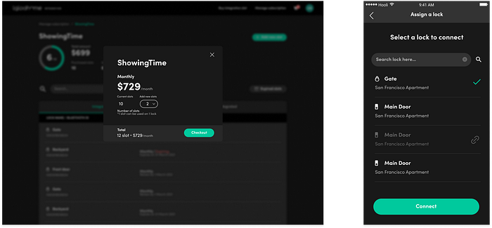
Our users were forced to switch between platforms for their integration. They begin by logging in and purchasing slots on the iglooconnect website and then continue on the igloohome mobile app to assign a lock to a slot, navigating between web & App. The web portal was only used for purchasing slots, other features like getting exchange codes or access management was done on the app.
Why can’t they do everything on one platform? Even me I asked the same question 😩
Problem 2: Obscure Content
It was difficult for our users to discover most of our content. For instance, users could not see the services they wish to integrate when they first arrive at the IGC website or log into the web portal. They had no idea what services are available until they login to the portal and click on the services tab.
Why does it take such a long process to see our service providers? 😩
Problem 3: Frustrating Navigation
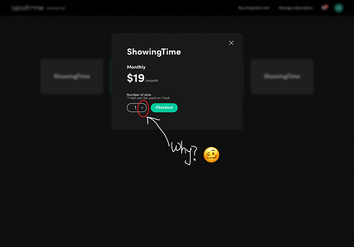
There were many frustrating navigation, for instance, when users are purchasing slots, they are forced to scroll through a lengthy list in order to select the number they want. This feature did not support our users to type the number of slots at once. Imagine wanting to buy 100 slots and having to scroll through from number 1 just to pick 100.
Why were we stressing our valued customers? omg!!😩
Problem 4: Broken Integration Links
A number of links from service providers were leading users to a blog post rather than the service provider. There was no management system, analytics, or dashboard to provide users with any data insights on their integrations, and many screens had extremely long loading times.
Now let’s examine our homepage, the information hierarchy and UX copy in addition to the visual elements.

In a nutshell, our homepage lacked good UX copy, information structure and wasn’t visually conveying the core message of iglooconnect completely.
I took the time to further investigate, brainstorm, and define potential solutions in order to address all these issues.
I thought that was all the problems and that I was armed with enough information for the redesign. Oh boy, I was wrong…🤦♀️
Defining the problem 🤔
Iglooconnect’s first version was solely dependent on the slot system, in which users purchased slots and then assigned locks to each slot in order to obtain exchange codes. For both users and us as a business, this was inefficient. It was time consuming and required many resources to handle everything from gathering data (like user card details for payment) to handling invoices, among other things. Streamlining this process to be more efficient as well as being able to classify our integrations were the major problems.
Ideating on the solution …🧠
In order to address the issue with the slot system, we needed to implement an OAuth system, which is essentially a post paid method that allows our users to connect with just one click and eliminates the need to purchase slots and then assign them to a lock. Additionally, they only pay for what they use, which is more beneficial for our users. Haven understood the problem and what needed to be done, it was time to put pen to paper.
I began by crafting the user-flows for the OAuth system…

…as well as drawing the information Architecture for IGC, categorizing various integrations and service providers.

Starting the design 🎨
Finally, my favorite part of this project. Yes! I began the design process by revamping our landing page, while taking into account all of the previously mentioned problems. Aside from visual elements, let’s break down each section to highlight some of the major changes in iglooconnect 2.0.

Key Mockups 💻
Some other screens from our dashboard redesigns are shown below.

Key Achievements 🏆
We derive great satisfaction in simplifying access automation for our users. Among our notable accomplishments are:
- Providing our users and partners with improved access solutions — By integrating lock solutions with our partner networks, businesses are able to automate access control for various scenarios, improving operational efficiency and user experiences.
- Expanding market presence of our partners — For instance, through the collaboration of Inlet listing as an integration partner, they have expanded their network and services beyond the Nordic regions, reaching businesses across Europe and the UK. Read full report here
- Providing tailored solution — Our customization ensures that businesses could implement access automation in a way that aligned with their unique requirements and operational workflow.
Conclusion 🎬
Making a redesign is one thing, making a redesign that’s impactful is another thing. As with every igloo product, we are committed to offering our customers with secure access, while providing them the most delightful experience possible in unlocking a world without keys. iglooconnect 2.0 is just a step towards our mission.
Going Forward 🚶♀️
The most important part of this project is the testing phase, which enables us to get real user feedback to refine our ideas and provide our customers with a better product. All of these are captured in the next series of this case study, iglooconnect 2.1, in which I discuss some insights gained using metrics and data to create impactful designs.

